Museum of Romanity
In 2018, we had the opportunity to express ourselves on the creation of a visual identity for the Musée de la Romanité in Nîmes. A museum that has since opened its doors to visitors and is located just opposite the famous Roman arenas. Unfortunately, the project teams in charge of this call for proposals did not seem "una-Nîmes" on our proposals. In spite of this, we propose you to discover this research...
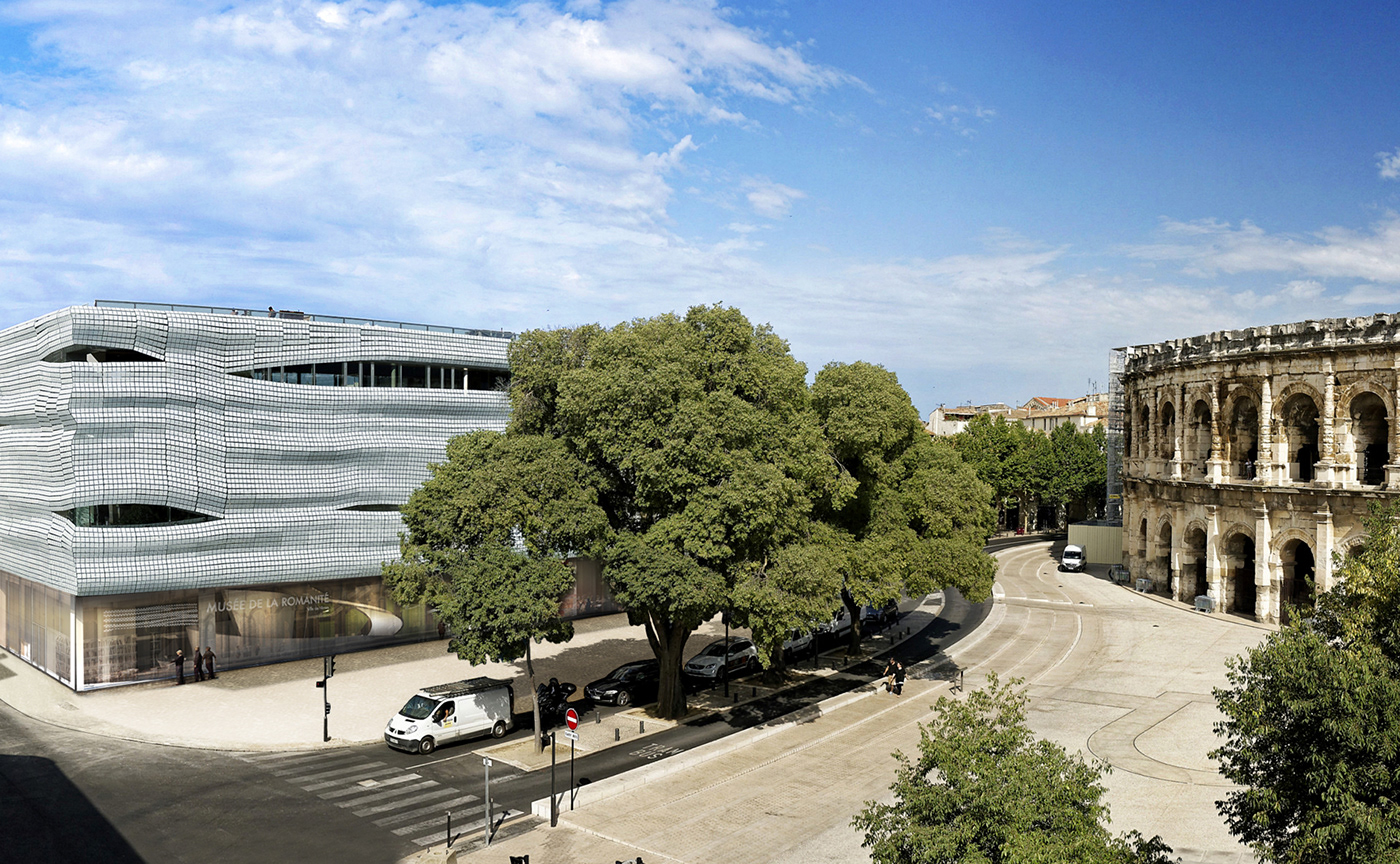


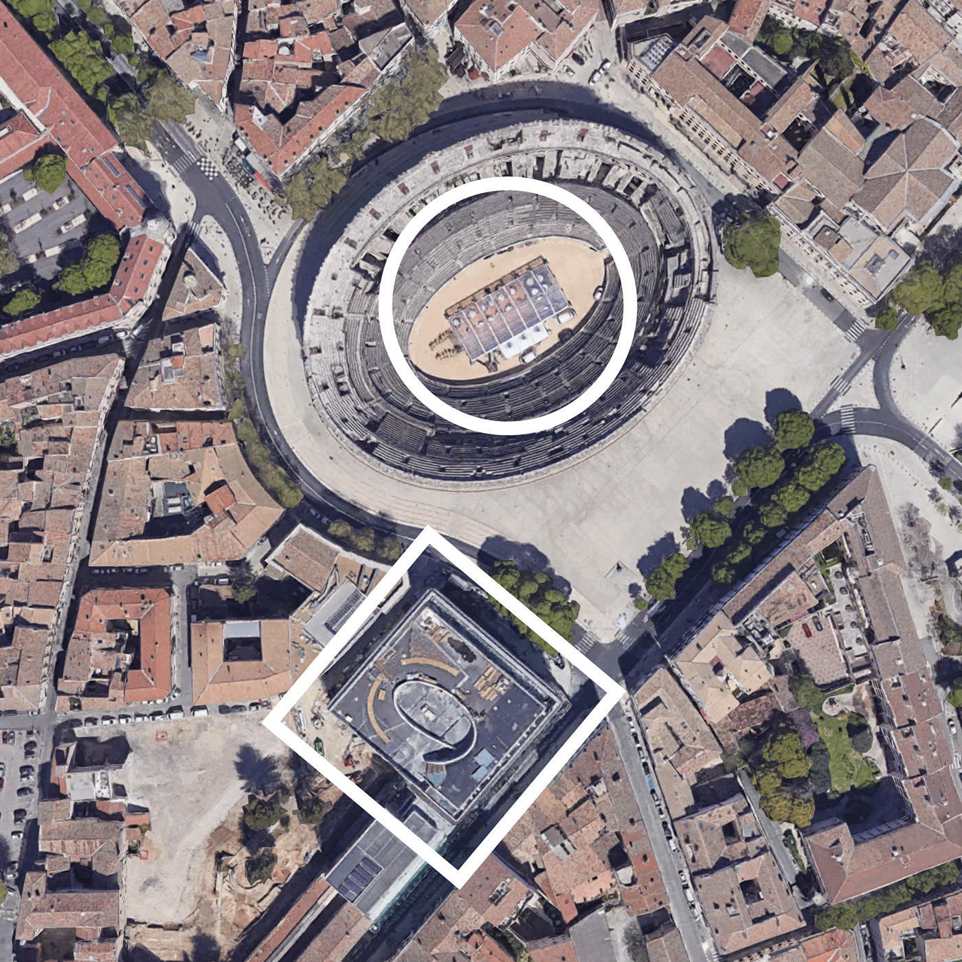
An architectural dialogue between yesterday and today
In 2006-2007, during preventive excavations a domus (Roman house) and two mosaics, known as Achilles and Pentheus, were discovered in perfect state of conservation. They are even described by specialists as "the most beautiful pieces after those of Pompeii". It is from here that the project to build a museum worthy of the name was born.
Launched in June 2011, the jury of the architectural competition selected Elizabeth de Portzamparc's project. Facing the Nîmes Arena, the Museum engages in a genuine architectural dialogue between the two buildings that separate 2000 years of history. The two buildings contrast and complement each other harmoniously through their shapes, lines and masses: the round and the rectangle, the vertical and the horizontal, the density of the stone and the lightness of the glass.
In our opinion, the challenge was to propose a resolutely contemporary reading for a subject that can easily fall into a classical... not to say nostalgic spirit. In short, how to make this ancient heritage current, alive and desirable!
A dialogue of shapes
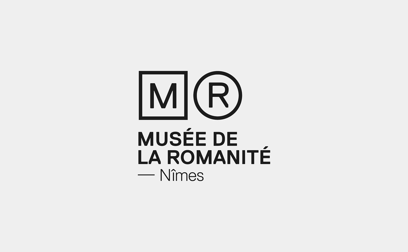
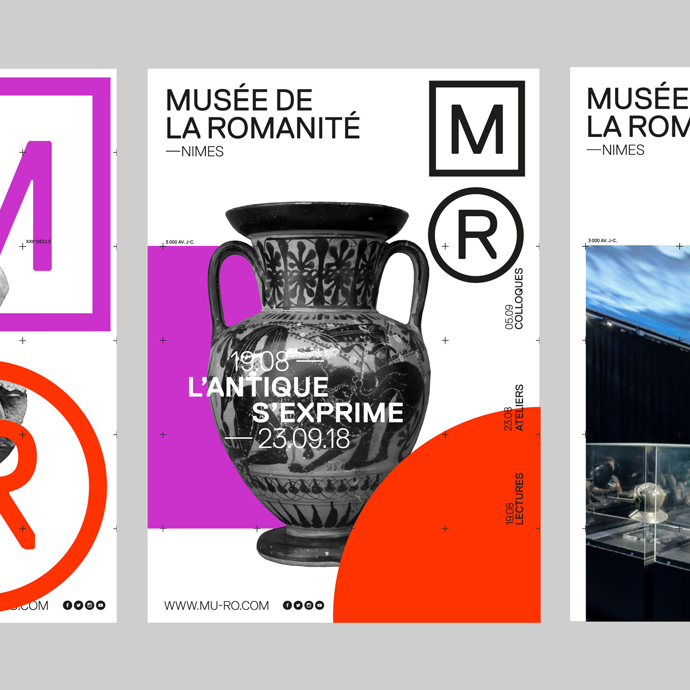
This research proposes to treat Romanity with a contemporary graphic language. To echo the museum in its architecture. We proposed very simply to start from the two most elementary geometrical shapes, the round and the square. The round for the Arena (R for Romanity), the square for the museum (M for Museum). These two forms both functioned as echoes, in similar ways to the two architectures. By choosing to use an acronym MR, it allows the introduction of a strong sign as a logo. It is modular and allows a direct identification of the institution.
Its modern design combined with the iconography of the museum (pieces, immersive photos) allows to define the personality of the Museum of Romanity: a place where history is spoken about in the present.